How to plan workflows - even before coding

Earlier this year we required out dev teams to make technical sketches.
And this works out really well.
I’ll show you how.
My name is Till Carlos and I document how my development teams become more effective. And today we are talking about how we make technical sketche for apps with forms.

Ever stared at a complex form design and wondered, “How on earth do we build this?” You’re not alone. Today, I’m going to show you a game-changing approach we use at our agency: technical sketches for form applications.
My name is Till Carlos and I document how my development teams become more effective. And today we’re talking about technical sketches for form applications.
Who is this for?
- Projects with many forms / wizards
- Devs who need another pair of eyes on their form
- Devs who want to challenge UX designers
- PMs requesting this type of sketch as a discussion base
- PMs who suspect the UX doesn’t cover all edge cases
The Problem
Picture this: Our team was knee-deep in a project with dozens of interconnected forms. Developers were constantly backtracking, and UX designers were frustrated by last-minute technical limitations. Then it hit us – we needed a bridge between design and development.
The Solution: Technical Sketches
We developed a system of creating technical sketches before any coding begins. Here’s how it works:
- Start with the UX: Use a tool like Excalidraw to import the design.
- Map the Data Model: Draw database tables and relationships as you go through the form flow.
- Note Controllers/Actions: Briefly mention which backend actions are triggered.
- Highlight Decision Points: Mark areas where business logic or complex validations occur.
- Review as a Team: Use the sketch as a discussion tool before any code is written.
Let’s use an example
To illustrate this process, let’s break down this event creation form from Dribbble: Event Creation Form

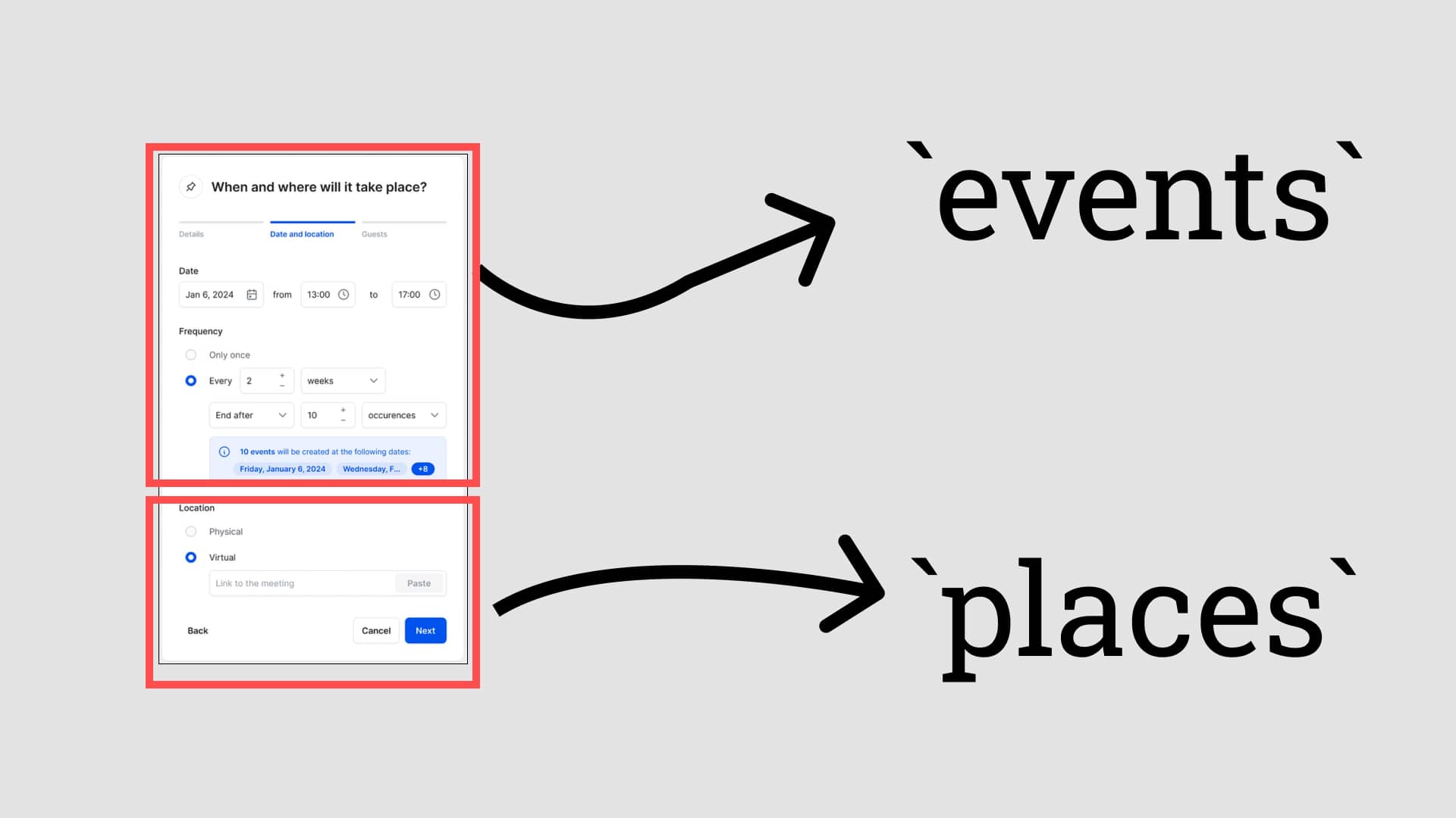
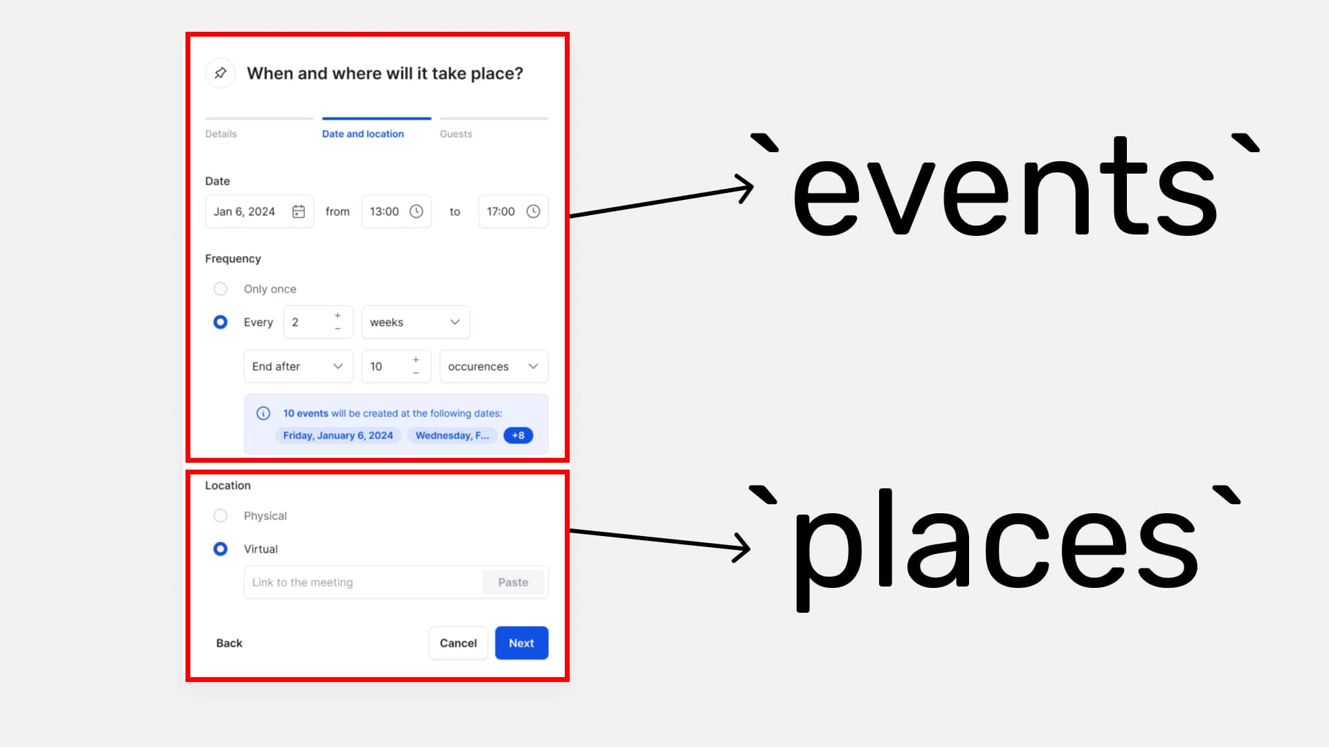
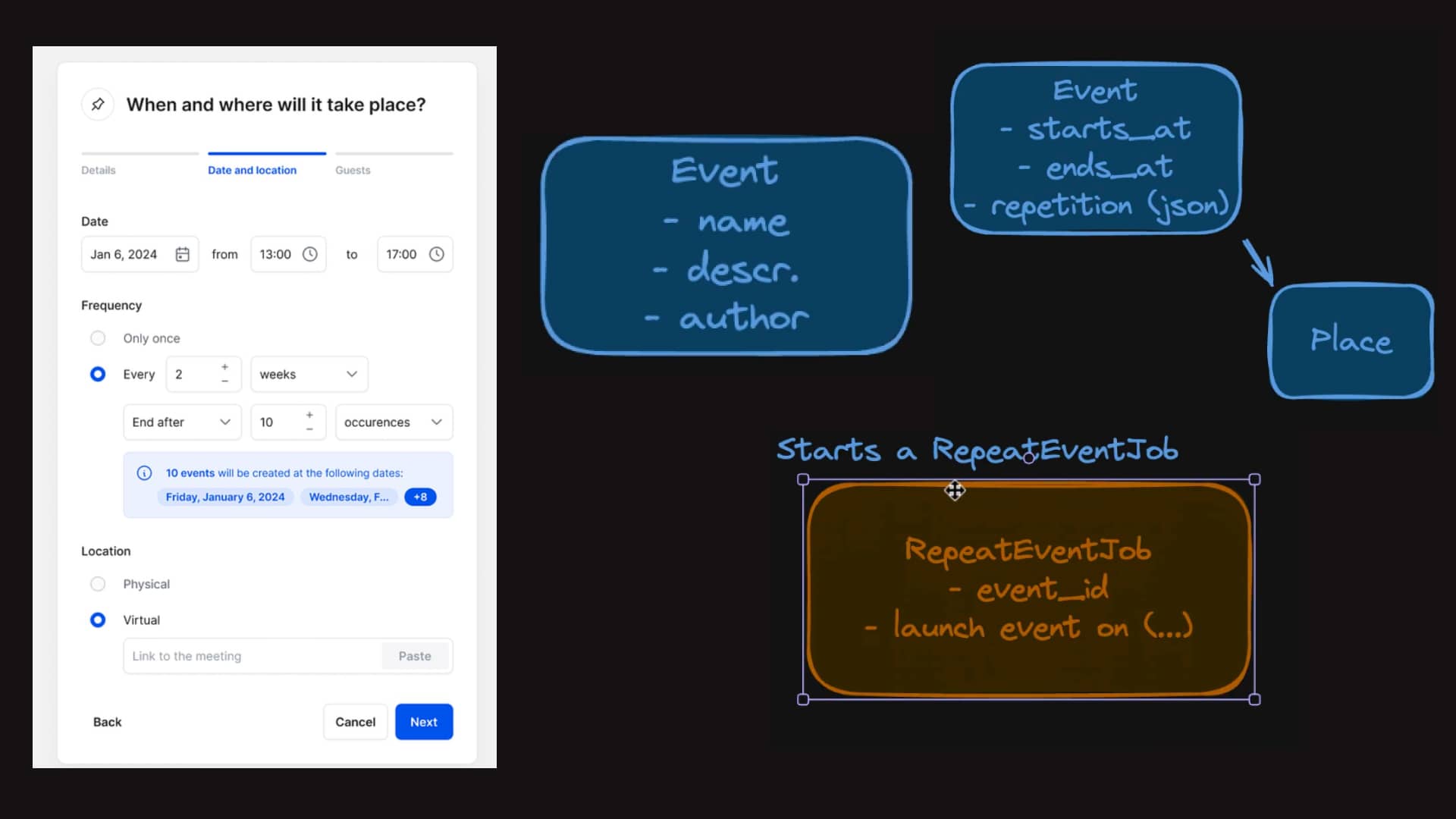
Start with the Event model:
- Fields: name, description, owner (logged-in user)
- Relationships: belongs_to :place
Add Place model:
- Fields: location (physical or virtual)
Handle Repetition:
- Add a ‘repetition’ field to Event
- Store configuration as JSON (frequency, unit, end date)
Consider Background Jobs:
- Add a RepeatEventJob
- Triggered when event is saved, not on form progression
Guest Management:
- Create Invitation model
- Use polymorphic association for ‘invitable’ (User or InvitedGuest)
Error Handling:
- Consider what happens if an email is unreachable
- Decide where to display errors
What We Learned
Through this process, we discovered several key benefits:
- Visualize the Data Flow: Mapping out database tables alongside the UI catches data inconsistencies early.
- Challenge Assumptions: Sketches give developers a platform to question complex UX decisions.
- Improve Communication: PMs, designers, and devs all speak the same visual language.
- Catch Edge Cases: Sketching forces us to think through error states and unusual scenarios.
The Benefits Are Clear
- Faster Development: Less rework when data models are planned upfront
- Improved UX: Designers understand technical constraints earlier
- Better Collaboration: A shared visual language for the whole team
- Reduced Bugs: Edge cases are identified before coding begins
We look into the page flow
We say what controllers we are accessing.
What are the error cases?
Benefits of this
- We test how the data model works together with the UX
- Devs don’t need to code, they can reason about the UX first.
In case: change the UX.
Sometimes the UX is too complicated and would waste time.
With a sketch like this developers can give the basis of simplification Sometimes the UX is too complex. Use your technical sketch to push for simplification. Show designers the technical implications of their choices, and work together to find elegant solutions that satisfy both user needs and technical constraints.
I’ve created a detailed video on this process here. If you’re interested in learning more or have alternative approaches, I’d appreciate your thoughts.
